Monday, November 17, 2014

Jack Whirler's Alphabet

Jack Whirler's Alphabet; or, The St. Paul's Primer. Adorned with Cuts by the Newberys, is a celebration of the engaging eighteenth-century children's books produced by three generations of the Newbery firm. Cotsen Children's Library at Princeton University holds the world's largest collection of Newbery children's books, and they published this handsome book showcasing their collection in honor of their benefactor and namesake, Lloyd E. Cotsen, on the occasion of his 85th birthday.
Designed by Mark Argetsinger, this amusing alphabet book is illustrated throughout with two Newbery blocks for each letter. Text on the facing pages explains the source of each woodcut and provides witty and informative commentary. The book was printed letterpress in black and red and handbound at the Press of Robert LoMascolo in Union Springs, New York in an edition of 200 copies.

The book is for sale for $85 and is being distributed exclusively by Bromer Booksellers.

For more information and to purchase Jack Whirler's Alphabet, click here.


Tuesday, November 11, 2014

Annual Reception for the Boston International Antiquarian Book Fair

Bromer Booksellers cordially invites you to our annual reception on the eve of the Boston International Antiquarian Book Fair, Thursday, November 13th from noon to 5pm. Please join us on the second floor of 607 Boylston Street for light refreshments, book conversation, and collegiality.

Visitors to our shop the week of the book fair will be the first to browse our recent acquisitions. Highlighting this new material are rarely seen items from the English illustrators David Jones and Eric Gill. These books, manuscripts, correspondence, and ephemera have not appeared on the market for generations.

We look forward to seeing you on the 13th!

Friday, September 19, 2014

Celebrating Beatrice Warde

Via
After a short hiatus, we're back on the occasion of typographical scholar Beatrice Warde's birthday. Born on September 20th, 1900, Warde lived during a renaissance in American and British graphic design and was a woman who made a name for herself in the then predominately male world of typography.

Warde had an interest in calligraphy and letterforms from a young age, and she was able to nurture and expand this interest after she became assistant librarian at the American Type Founders Company in 1921. Her position allowed her to spend time researching typefaces and printing history, a pursuit which led to the publication of "The Garamond Types, Sixteenth and Seventeenth Century Sources Considered," an article Warde wrote and published in The Fleuron under the pseudonym Paul Beaujon in 1926. This article cemented Warde's influence as a scholar of typography by tracing the origins of Garamond types and finding that certain types initially attributed to Garamond were, in fact, cut by Jean Jannon.

The previous year, Warde had married typographer Frederic Warde, and the couple had moved to London, where Warde worked at The Fleuron under the editorship of Stanley Morison. When her pseudonymous article appeared, Warde, as Paul Beaujon, was offered the post of editor of the Monotype Recorder, an important source of publicity for the Langston Monotype Corporation. She accepted the position, revealing herself to be a woman and earning a place as one of the few women working in the field of typography at the time. A few years later, Warde was promoted to the post of publicity manager and remained there until her retirement in 1960.

Via
While at Monotype Corporation, Warde worked with many famous type designers, including Stanley Morison, who was the typographic adviser, and Eric Gill, whose Gill Sans and Perpetua types were produced by Monotype. It was through the confluence of these two men's influence that Warde's perhaps most far-reaching contribution was born.

Warde's "This is a Printing Office" broadside, designed to showcase Gill's Perpetua titling capitals, was published in 1932. It was one of many broadsides Monotype produced, at Morison's suggestion, to display their type designs. However, this particular broadside carried a singular message, that the printed word is essential in the preservation of a free society. Here are her words in their entirety:


Via
This is a
Printing Office

Crossroads of Civilization
Refuge of all the arts
against the ravages of time
Armoury of fearless truth
against whispering rumour
Incessant trumpet of trade

From this place words may fly abroad
Not to perish on waves of sound
Not to vary with the writer's hand
But fixed in time having been verified in proof

Friend, you stand on sacred ground

This is a Printing Office   


The broadside resonated with many, so much so that the words were cast in bronze and now stand at the entrance to the United States Government Printing Office. They were also translated into many languages and grace the walls of printing shops around the world.

Via

Warde continued to advocate for and teach young type designers about the benefits of the classical forms of typography until her death in 1969. In particular, she espoused type design that disappeared behind the ideas it was conveying, stating in her essay "The Crystal Goblet" that "Type well used is invisible as type." This coincides with her characterization of the printing office as the "crossroads of civilization." Printing and typography were meant to be utilitarian, the means to bring brilliance from the mind to the world.  


Around 1978, Monotype reissued Warde's iconic broadside in a way that better exemplifies its meaning and impact in the world. The broadside presents Warde's powerful message in Latin and sixteen other Western languages, from English and Icelandic to Turkish and Croatian. It measures approximately 24 3/4 by 19 3/4 inches and is printed in seventeen different types. It is a fitting tribute to Beatrice Warde, who dedicated her life to the transmission of ideas through typography.

For more on Beatrice Warde, see below:

Princeton University Library Graphic Arts Collection's Unseen Hands exhibit
Typography Online
University of North Texas College of Visual Arts and Design Communication Design Blog

For more on Monotype's reissued broadside, visit our website.

Monday, July 28, 2014

Miniature Book Society Conclave in Boston, August 15-17

The Miniature Book Society is an organization interested in all aspects of miniature books, or books measuring three inches or less, including the design, production, and distribution of these tiny treasures. Every year, members of the Society meet around the world for a conclave, during which they take part in bibliophilic activities with special focus on books in small formats.

This year's conclave will be held in Boston from August 15-17th, and we are very excited to welcome Society members to our fine literary city. Activities will include a tour of the Boston Athenaeum, a presentation by a miniature book binder from the North Bennet Street School, and visits to the American Antiquarian Society and Clark University's Goddard Library in Worcester, which holds the miniature book that went to the moon.

On Friday afternoon, August 15th, from 2 to 5pm, we will be hosting a reception for conclave registrants, where our entire selection of miniature books, over 500 volumes, will be on display and for sale. We will also have a table at the conclave book fair, which will be at the Taj Hotel on Sunday, August 17th. The book fair is open to registrants from 9-11am and open to the public from 11am-4pm.

If you would like to see a preview of what you can expect at the book fair, you can visit the Brookline Public Library, which currently has miniature books on display. The exhibit offers a glimpse into the history of miniature books and is a traveling display provided by the Miniature Book Society. It is definitely worth a visit.

If you are unable to attend the book fair or see the exhibit, you can view the video below, which was produced by the Weston Media Center and follows local collector Melinda Brown as she talks about her own miniature books and then visits our shop to discuss the variety of miniature books we have for sale.


If you are interested in miniature books and have questions or would like to talk about starting your own collection, developing or selling a current collection, please contact us or come by our shop in Copley Square.

Thursday, June 19, 2014

E-catalogue 40: Recent Acquisitions for Early Summer


Welcome to our 40th e-catalogue, comprised of a varied, interesting selection of recent acquisitions priced under $2,000. When putting this selection together, we aimed to include books that covered all of our specialty areas, which in a couple of cases, are combined. For instance, we are offering a copy of Thoreau's A Yankee in Canada -- one of 1,546 copies of the first edition -- that features a very handsome full morocco binding by Stern & Dess.


This grouping also reflects some of our present buying focus: included here are several movables, one of which is by contemporary French artist Philippe Huger. Press books, as always, are well represented and include two illuminated Roycroft Press books and a fine set of the Nonesuch Blake with good provenance and wearing unrecorded dust wrappers.

We hope you enjoy our offering and wish all of our customers a fine, relaxing summer.

Wednesday, May 28, 2014

Agassiz Lecture Follow-up and Video


On April 30th, 2014, Anne Bromer delivered a lecture at the Boston Athenaeum titled "Elizabeth Agassiz: Ahead of Her Time and of Her Time." The talk was recorded by the excellent staff at the Athenaeum, who gave us permission to share the video with our followers on social media. View the video below, along with a few photos of the event. Of special significance to Anne and those gathered for the talk, members of the Agassiz family were in the audience and shared their family lore with the attendees.


Anne and the Agassizs

Thursday, May 22, 2014

The Work of Julius Klinger on His Birthday

Via

Today is the 138th birthday of Austrian illustrator, typographer, and graphic artist Julius Klinger. Born outside of Vienna on May 22nd, 1876, Klinger is best known for his innovative poster design, which earned him acclaim in Germany and Austria in the early 20th century. His style was functional, clear, and clean, especially compared to the styles of Art Nouveau (or Jugendstil) and the Vienna Secession movement that were popular at the time. In an essay on the subject, Klinger rejected the idea of ornamentation for its own sake, and this shows in his advertising art, which featured clean lines and a limited color scheme.


Via

Klinger's first job after completing his studies at the Technologisches Gewerbemuseum in Vienna was drawing for the Viennese fashion magazine Wiener Mode in 1895. The following year he moved to Munich, where he worked for several art journals, including the Meggendorfer Blätter and Die Jugend. All of these early positions required illustration in the latest style - namely, Jugendstil.


While working at Wiener Mode, Klinger met Koloman Moser, who acted as a mentor to the young artist and would go on to co-found the Wiener Werkstätte. These workshops grew out of the Vienna Secession, which was a reaction against the conservative aesthetics of the Association of Austrian Artists at the Vienna Künstlerhaus. Moser, and his partner Josef Hoffmann, were inspired by contemporary European design, such as the Glasgow School in Scotland and Art Nouveau in France.


During this period, Klinger co-founded a design studio in Berlin and released several portfolio books of patterns and designs, all in the Jugenstil style. One such portfolio is La Femme dans la Décoration Moderne. It contains thirty color lithographs depicting women in various contexts, including nudes, fashion illustrations, and ornate borders, all in bold shades of orange, blue, green, yellow, and brown. The illustrations come from posters, wallpaper, ceramics, jewelry, and other decorative arts of the period, but all derive from Klinger's work for fashion and art periodicals.


In some examples, the figures of women are incorporated into repeating patterns, while others stand alone, adorned with floral motifs or framed by sinuous lines. Portraits depict the active "femme nouvelle" taking photographs, playing tennis, fencing, and out on promenade in the latest fashions. The hedonistic "demimonde" is also represented, shown drinking, smoking, and dancing. Some illustrations are more fantastical, depicting women as fairies or mermaids, while others reflect the period's taste for orientalism and exoticism by incorporating Egyptian and African motifs.


Via
Klinger's poster designs, for which he gained the most acclaim, draw on and reflect the influences of his training illustrating Jugendstil fashion magazines and his graphic design work. Even his later posters show the fine detailed lines required to bring figures and their clothing to life.

Klinger's last poster design, 1937. Via

Into the 1930s, Klinger's style was still evolving as he taught his modern approach to advertising design in Germany and attracted the notice of companies in Europe and the United States. Sadly, his life and talents were cut short. He and his wife, who were both Jewish, were deported to Minsk in 1942 and killed soon thereafter.  

For more on Julius Klinger, his life, and work, see below. To read more about La Femme dans la Décoration Moderne, visit our website, and as always, we thank you for reading.

Sources:

Friday, May 2, 2014

Norman Rockwell's Huckleberry Finn


In honor of the 2013 World Series win by the Boston Red Sox, which saw the Sox rise from last place to World Champion, the Museum of Fine Arts in Boston has on display Norman Rockwell's iconic painting "The Rookie." Completed in 1957, the work depicts the yearly rite of passage that incoming rookies experience when they first enter the locker room during training camp and walk past the veteran players to find their place, both in the locker room and on the team. The rookies hope to prove themselves so that they can eventually join the ranks of those veterans. It is the meeting point of the American dream and America's pastime.


Twenty years before he completed "The Rookie," Rockwell worked on another American tale: The Adventures of Huckleberry Finn. He was commissioned to illustrate the 1940 Heritage Press edition of the Mark Twain classic in 1935, and from those eight paintings, a lithographed album was published in an edition of 200 copies in 1972. The lithographs in the portfolio are printed in full-color on handmade Velin d'Arches paper and signed by the artist in the lower right corner.


The scenes depicted are "Then Miss Watson took me in the closet and prayed"; "Jim got down on his knees"; "When I lit my candle"; "My hands shook"; "Your eyes is lookin'"; "Miss Mary Jane"; "Then for three minutes, or maybe four"; and "There warn't no harm in them." Considering the memorable scenes in Twain's novel, it is interesting that Rockwell chose to highlight moments of interaction that reveal the characters' emotions and personalities rather than showing the points of greatest action in the story.


Perhaps it is because the artist's genius lay in his ability to portray an idealized vision of small-town America or because Rockwell had an admitted aversion to life's rougher, seedier aspects. Whatever the reason, he was able to portray the simplicity of life, even in a novel with a cast of characters that included murderers, swindlers, drunkards, and thieves. This suite of illustrations represents an essentially sympathetic depiction of the American experience and, like "The Rookie," shows the small, personal moments that unite humanity.


For more information about the portfolio, Huckleberry Finn. Eight Signed Color Lithographs Based Upon Incidents in the Mark Twain Novel, please visit our website, and as always, we thank you for reading.

Monday, April 28, 2014

Anne Bromer to speak at the Boston Athenaeum

This Wednesday, April 30th at 6pm, Anne Bromer will speak at the Boston Athenaeum as part of their public lectures series. Her talk is titled "Elizabeth Agassiz: Ahead of Her Time and of Her Time" and focuses on the life and ideas of Elizabeth Cary Agassiz. The full description from the Boston Athenaeum is below, along with the event details.
Elizabeth Cary was born into the elite of Boston. Her wealthy maternal grandfather, Thomas Handasyd Perkins, still holds court in a dramatic portrait in the Boston Athenæum’s Long Room. Despite the strict ideas about gender roles of her time, Elizabeth loved science. She married a leading scientific luminary of nineteenth-century America,  Louis Agassiz, a major celebrity in his day and founder of Harvard’s Museum of Comparative Zoology.

Author Anne Bromer describes how, against very long odds, Elizabeth founded Radcliffe College to give women, for the first time, the benefit of a Harvard education. She served as the school’s first president and wrote four books, one of which documented the daily life of women who lived along the Amazon River in Brazil.

Mrs. Agassiz also loved Nahant, a village just north of Boston which juts into the ocean at the northern tip of Boston Harbor. Here she summered from childhood.The town was the inspiration for her first two books, about the scientific and aesthetic properties of the ocean surrounding Nahant— love letters to the sea life of this island community.
The event is open to the public and is $10 for members or $25 for non-members. Pre-registration is required, and a reception will follow the talk. The Boston Athenaeum is located at 10 1/2 Beacon Street in Boston, adjacent to the State House.

Wednesday, April 23, 2014

Edgar Allan Poe Returning to Boston

Bromer Booksellers has joined a variety of philanthropic organizations in donating money with the goal of erecting a statue of Edgar Allan Poe in Boston. The project has reached its fundraising goal, and the sculpture, titled "Poe Returning to Boston," will be unveiled on Sunday, October 5th, 2014. See below for details about the project:


The Edgar Allan Poe Foundation of Boston has set the date for the official unveiling of Stefanie Rocknak’s sculpture, "Poe Returning to Boston," on Sunday, October 5, 2014, at 2pm. A recent grant of $10,000 from the Lynch Foundation helped the project reach its fundraising target of $225,000, a total that will cover the fabrication, transportation, installation, and long-term maintenance of the statue.

Rocknak’s sculpture will be installed at the intersection of Boylston Street and Charles Street South—which, in April 2009, Mayor Thomas M. Menino dedicated to the Boston-born author of “The Tell-Tale Heart,” “Hop-Frog,” “The Raven,” and many other classic works.

Last summer the city’s Public Improvement Commission approved the installation plan for the statue, and the Boston Art Commission gave final approval to the statue’s design. With these approvals in place, Stefanie Rocknak, the sculptor whose work was chosen from 265 proposals, spent last autumn transforming her 18” carved wooden model into a life-sized clay statue.


“A wax positive of the pre-bronze, clay sculpture,” Rocknak observed, “is currently being completed by New England Sculpture Services in Chelsea, MA. After I take a look at the positive, which is in pieces, and make any necessary adjustments, the casting will begin. Once the piece is cast and assembled, the patina will be applied. It will be finished by the end of August.”

Shawmut Design and Construction of Boston has been hired to install the sculpture in a process that will begin next September and lead to an official unveiling 2 days before the 165th anniversary of Poe’s death on October 7, 1849.

“As is the case with many public art projects, the total cost of the Poe statue has increased from early projections,” said Poe Foundation chair Paul Lewis who teaches American literature at Boston College. “Costs rise late in a process like this as contracts are negotiated with both the city and vendors. In the case of the Poe statue, prices for some work turned out to be higher than we had expected, while commitments to fund long-term maintenance and contingencies that add elements of the unpredictable arose over the past 9 months. We’re grateful for donors, large and small, that have helped us keep up with these cost increases.”


Commenting on the statue, Karin Goodfellow, Director of the Boston Art Commission, noted that "the Commission is looking forward to the installation of Stefanie Rocknak's Poe Returning to Boston in the fall. A model of private-public cooperation, the whimsical piece will connect us to our literary history and remind us of the importance of art for art's sake."
.
“Reaching this point in Boston’s complex public art process required the effort and enthusiasm of many people, including Steff Rocknak, our brilliant artist, and our donors,” said Lewis. “Early on we were thrilled to have the support of the Edward Ingersoll Browne Trust Fund, Stephen and Tabitha King, Poe collector Susan Jaffe Tane, Poe scholars Richard Kopley and Philip E. Phillips, as well as neighbors and abutters, including Michael B. Moskow and Patricia Bartevian.”

Other contributors to the project include the Highland Street Foundation, George B. Henderson Foundation Fund for the City of Boston, Poe Studies Association, Boston College, Boloco, Bromer Booksellers, Samet & Company, PC, L. J. Peretti Company, Volunteer Lawyers for the Arts of Massachusetts, and Poe fans here and around the world.


Looking forward to seeing her work completed, Rocknak says, “This has been a long but an enjoyable process. I can’t wait for the day that I am standing in Poe Square, watching the piece come down the road on the transport truck. At that point, it will only be a matter of hours before the sculpture is secured to its final resting place.”

The Edgar Allan Poe Foundation of Boston, a nonprofit 501(c)(3) corporation, invites the public to visit its website and Facebook page to learn more about the project. Information about upcoming events sponsored by the Foundation—including walking tours of Poe’s Boston on Sunday, April 27, noon-1:30pm, and Sunday, May 18, 2-3:30pm, both starting in Poe Square—can also be found on our Facebook page.

Background
Supported by a planning grant from the city’s Browne Fund, the Poe Foundation of Boston has moved through a 5-year undertaking. In 2009 we began to think about ways to memorialize Poe’s connections to the city of his birth. In 2011 we issued a call for artists that resulted in 265 applications from which 3 finalists were chosen. After a period during which about 1,500 people commented on these designs, a statue called Poe Returning to Boston by Stefanie Rocknak was selected. Rocknak describes the work as "a life-size figure in bronze, approximately 5’ 8” tall. Just off the train, Poe is walking south towards his place of birth. With a trunk full of ideas—and worldwide success—he is finally coming home.”

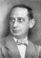
Stefanie Rocknak in her studio

An award-winning member of the Sculptors Guild whose artwork has appeared in numerous publications and in more than 40 exhibitions including at the Smithsonian, Stefanie Rocknak is also a professor of philosophy and the director of the Cognitive Science Program at Hartwick College in Oneonta, New York, where she has taught since 2001. A graduate of Colby College in Waterville, Maine, with a B.A. in American Studies and Art History with a concentration in studio art, she holds a Ph.D. in Philosophy from Boston University. Her interests include the 18th-century Scottish philosopher David Hume (the subject of her forthcoming book), the philosophy of art, and the philosophy of the mind.


Thursday, April 17, 2014

Bromer Booksellers in the New York Social Diary

Anne Bromer with miniature book collector Patricia Pistner
Jill Krementz of the New York Social Diary stopped by our booth at the New York Antiquarian Book Fair and entered the fascinating world of miniature books. She wrote about the experience in her coverage of the book fair, which can be read in full here.


About the above pictures Ms. Krementz wrote:

"Ray Bradbury did pop-ups. While I was looking at this tiny treasure, David Bromer decided to buy it for his own collection ($750).

"'He gets a huge discount,' his wife said. He also got a big kiss.

"'But hey, do I get a commission?' I replied."

Thursday, April 10, 2014

New Exhibition at the Boston Athenaeum

T. Sturge Moore, The Little School. London, 1905.
Bound by Sybil Pye. Athenaeum Purchase, John Bromfield Fund, 2002

Collecting for the Boston Athenæum in the 21st Century: Rare Books and Manuscripts

April 23, 2014 - August 9,  2014

This Exhibition is a celebration of some of the most beautiful and important rare books and manuscripts acquired by the Boston Athenaeum Library since 2000. Many of the books to be exhibited are handsomely illustrated such as Thomas Pattison Yeats' Institutions of Entomology which is celebrated for the individual life-size paintings of insects that were added to the pages of the book by Louisa, Countess of Aylesford. La Création, which was printed in Paris by Francois-Louis Schmeid in 1928, is illustrated by numerous multicolored art deco woodblock print. Fine bindings will also be featured in the exhibit. A particularly unusual one of engraved tortoise shell, dating from 1693, covers The Truest and Largest Account of the late Earthquake in Jamaica.

All of the works on view are “extraordinarily rare.” “‘Rare’ means not very many of them,” Stanley Cushing, Anne C. and David J. Bromer Curator of Rare Books and Manuscripts, explains, “or they could be very valuable, they have very interesting previous owners, or unusual bindings. The show is a selection of a select view. This is the cream of the crop of everything I  have bought since I have been curator.”

Cushing joined the Boston Athenæum staff in January 1971 and for many years headed the Conservation Laboratory. He became the Athenæum’s first curator of rare books in 2002. He was later appointed curator of rare books and manuscripts and became the Anne C. and David J. Bromer Curator of Rare Books and Manuscripts in 2012.

“The reason I am curator now is that I worked for decades as a conservator at the Athenæum and knew where we had collected and where the gaps wear. I have worked on filling those gaps. We have built what is meant to be a didactic collection, to show to members, researchers, and staff. They are meant to be studied and all are available for examination and study.”

About the Boston Athenæum:

Founded in 1807, the Boston Athenæum is one of North America’s oldest cultural institutions. The first floor of its National Historic Landmark building at 10 1/2 Beacon Street, Boston, including the Norma Jean Calderwood Gallery, is open to the public Monday, Tuesday, and Wednesday, 9:00 a.m. to 8:00 p.m., Thursday and Friday, 9:00 a.m. to 5:30 p.m., and Saturday, 9:00 a.m. to 4:00 p.m. There is a $5 admission fee for non-members to special exhibitions. Other public events at the Athenæum include exhibitions, lectures, readings, panel discussions, films, and concerts. For membership, events, and other information, please visit www.bostonathenaeum.org or call 617-720-7604.

Thursday, March 27, 2014

New York Antiquarian Book Fair 2014


Bromer Booksellers will be exhibiting in Booth E9 at the 54th New York Antiquarian Book Fair from April 4th through 6th, with a preview night on Thursday, April 3rd. We will be bringing a selection of designer bindings, several of which were featured in a recent Guild of Book Workers Journal article. This will be in addition to an array of fine press publications, children's books, and miniature books.

The book fair is located at the Park Avenue Armory, and the hours are as follows:

Thursday: 5-9pm
Friday: noon-8pm
Saturday: noon-7pm
Sunday: noon-5pm

Tickets can be purchased online or at the door:

Preview pass: $60 (includes run-of-show ticket)
Daily admission: $20
Run of Show: $45

Visit the official book fair website to view a complete schedule for the show, including information about Discovery Day on Sunday, April 6th. We hope to see you at the fair!

Saturday, February 22, 2014

Happy Birthday, Eric Gill!

Eric Gill, 1927
 Source

Eric Gill was born February 22, 1882, making today his 132nd birthday. A talented sculptor, typographer, and illustrator, Gill's life was a study in contrasts. A deeply religious Roman Catholic who believed that sexuality was an expression of the divine, and an artist who defiantly characterized himself as a workman in the medieval tradition while his statues, illustrations, and typefaces adorned the modern buildings and pages of his era, Gill unified seemingly opposing ideas in his life and work. In the Introduction to the catalogue of the Humanities Research Center's Eric Gill collection, John Dreyfus writes that "A crystal-clear motive lay behind Eric Gill's most industrious and diversely creative life. He organized his work quite simply as a praise of life-- as a way of giving praise to his maker."


Approaching the practice of art as spiritual work, Gill continually made sketches and studies as part of his method. In her biography of Gill, Fiona MacCarthy notes that the artist came to life drawing fairly late in his career. According to MacCarthy, "He put forward the endearing theory, in the introduction to Twenty-five Nudes, that one could not embark on life drawing any earlier because one did not really know enough about life." His live-in mistresses were his primary models, and this nude study captures the essence of his subject with a few precise curving lines and a hint of shading. Dated April 1927, the drawing was likely done during Gill's protracted vacation stay at Salies-de-Béarn in the Pyrenees from the fall of 1926 through the spring of 1927. There, the Gill family shared a house with Elizabeth Bill, who was Gill's secretary and mistress during this period and who may have been the model for this drawing. 

We hope you will join us in celebrating Eric Gill's unconventional life and work, and his enduring contributions to the worlds of art and design.

For more information about Gill's life and art, see Fiona MacCarthy's biography of the artist, Margaret Smith's essay in the Houghton Library Catalogue for the 1994 exhibition Eric Gill: The Cell of Good Living, and The Eric Gill Collection of the Humanities Research Center: A Catalogue, compiled by Robert N. Taylor. Visit our website to view more examples of Gill's work.

Tuesday, February 4, 2014

Bromer Booksellers in Pasadena

Click here to print a coupon
for $2 off fair admission

Bromer Booksellers will be exhibiting at the California International Antiquarian Book Fair in Pasadena this year from February 7-9. Come by booth 508 to see our excellent display of miniature books, fine printing, fine bindings, illustrated books, and first editions.


To view a selection of items we will be bringing, download a pdf of our book fair list here, or contact us to be mailed a printed copy.

Among the material we will have on display is a wind-up musical Ombro-Cinéma (see video below), a rare architectural alphabet by Jean Baptiste de Pian, a Book of Hours with extensive dance of death cuts, one of ten copies of the Vale Press Bibliography printed on vellum, and a trade catalogue containing salesman's samples of decorative lids for cookie tins.

Additional details about the fair can be found here. Click here to print a coupon for $2 off admission. We hope you will visit us in Pasadena to explore these and the many other items we will have on offer.


Wednesday, January 22, 2014

Japanese Surimono


Surimono, meaning "printed thing," are a subsection of traditional Japanese woodblock prints. They were printed on commission in small numbers and generally not sold by art publishers, unlike their more commercialized companions, ukiyo-e woodblock prints. Known as far back as the early 18th century, surimono rapidly rose in popularity in the 19th century. They were printed on high-quality paper, called hôsho-gami, using the finest printing techniques. Prior to 1810, these sheets could be quite large and folded so that the illustration accompanying the text faced outward. Later into the 19th century, however, sizing of surimono became more standardized and most were printed on small, nearly square sheets called shikishiban.


Most surimono consist of poetry surrounded by images. They were often distributed among members of a literary club, called ren, which practiced the art of writing poetry, generally under the instruction of a known master. Many surimono were also commissioned as New Year's greetings or to commemorate special occasions.


For contemporary admirers of surimono, the poetry is of secondary importance, as its meaning would only be known among the members of the poet's circle. It is the illustrations, often heightened with mica, silver, and embossing, that bring such beauty to these small prints. The coming of spring was often represented with plum blossoms and other flowering trees and brilliant colors. The imagery often depicts animals of the zodiac, beautiful women, flowering trees, or still lifes. Books and scrolls are sometimes included, but are not common.


The collection illustrated here contains sixteen surimono depicting scenes that include books and scrolls, dating mostly from the early part of the 19th century. This collection was gathered over twenty years and, to our knowledge, is unique in its focus on images of a literary nature.


The artists included are Yashima Gakutei (1786-1868), Toyota Hokkei (1780-1858), Utagawa Kunisada (1786-1865), Yanagawa Shigenobu II (1787-1832), Ryuryukyo Shinsai (1764-1820), and Suga Shoho (1790-1852). The artists of two of the surimono are anonymous.


One illustration by Yanagawa Shigenobu II, the pupil, and later son-in-law, of the master Hokusai, depicts a courtesan tuning a samisen while sitting in front of a book of poetry. A cat sits by her side, and cherry blossoms are behind her. Patterns on the hem of her kimono, her hair ornaments, and her calligraphy brush are heightened with metallic silver ink, and her instrument and inkwell have decoration in gold.


In another surimono by Yashima Gakutei, perhaps the most prolific of all surimono artists, the poetess Murasaki Shikibu sits next to her writing desk among stacks of books. The border around the image and the moon overhead are printed in silver, and her colorful kimono is partially patterned in silver.


The largest surimono in the collection depicts pages from a famous illustrated book, Hykanunin isshu, a collection of one hundred poems by one hundred famous poets.


Other surimono in the collection depict still lifes with books and writing instruments, and poets accompanied by animals of the zodiac. The prints range in size from 5 1/4 by 7 1/4 inches to the longest, in a panorama format, measuring 22 1/2 by 8 1/2 inches.


Visit our website to learn more about this collection of surimono. The Museum of Fine Arts, Boston owns a large collection of surimono, many of which are digitized on their website. To delve deeper into the history of surimono, go here. As always, thank you for reading.